Over half of users exit after one page, indicating poor navigation, limited content discovery, or low engagement.
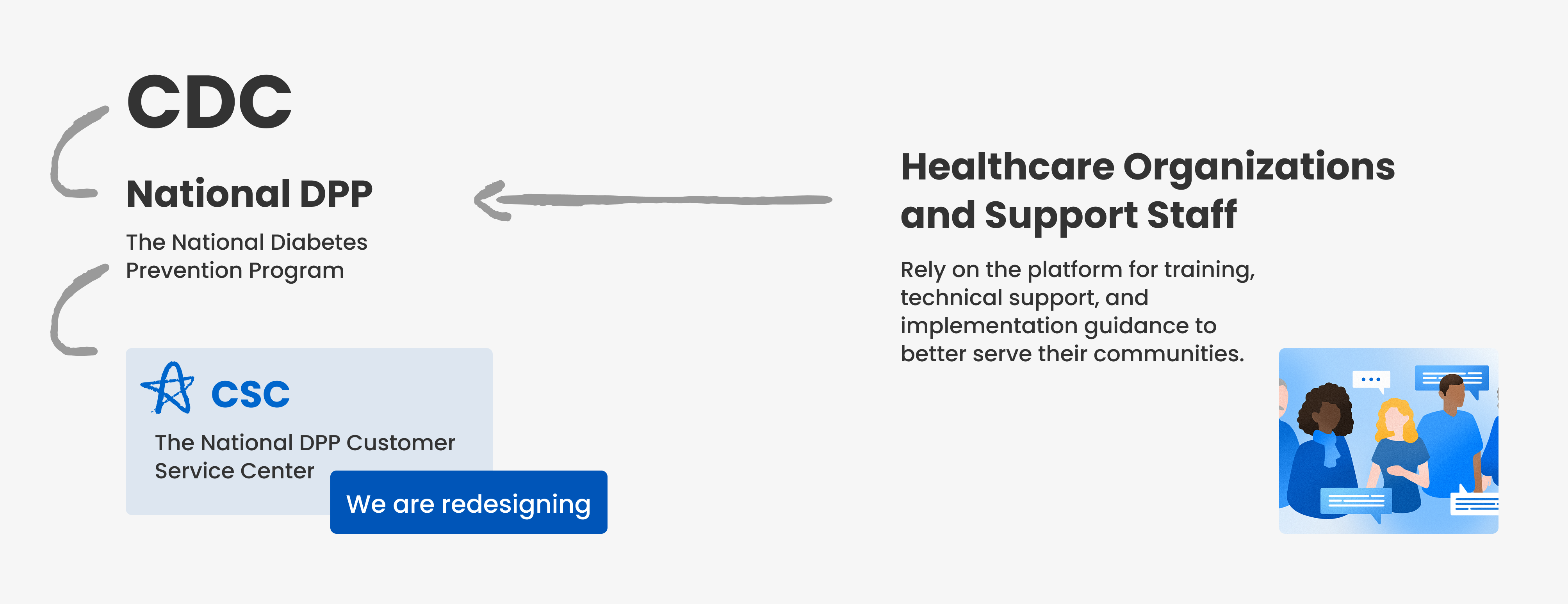
Primary Research - Current Website Usability Testing
To understand how users of the CSC experience the website and identify potential areas of improvement, our team conducted user testing. Our user testing revealed key usability challenges within the CSC platform, particularly in navigation, resource accessibility, and task efficiency.
Users Comments

Testing Insights - Key Problems of Current Site

Sensory Cue - Color
One design debate followed us through the entire 10-week journey: Green or Blue ? Each of us had our own preferences — some leaned toward green for its freshness, and others liked blue for its calmness. But ultimately, it wasn’t about us. We performed sensory cue testing to discover which color palette would most successfully translate the website's meaning, and users were able to share their thoughts about how the different palettes made them feel.
What would our users respond to?
To dig deeper, We gathered 20 responses, and a clear theme emerged. Most people associated blue with trust and security — values that strongly align with CDC’s branding.
On the other hand, those who preferred green linked it to healing and wellness, but some noted that too much of it felt overwhelming. This gave us the clarity we needed to move forward with a more intentional, user-driven color choice.
What can we do better or differently? We started by listening to the numbers and learning from others.
Design Opportunities
We analyzed leading healthcare websites to understand their navigation structures, content organization, and accessibility strategies.
With insights from our research and usability testing, this analysis directly informed our early design decisions that directly address users’ key pain points. These insights guided our design direction from the start.

let's talk about how we get to the final design.
Imagining the solution
Ideation and Iteration
We identified major IA pain points in the current website, including overlapping categories and unclear navigation. By conducting competitive analysis and usability tests, we simplified the hierarchy, merged redundant sections, and relabeled content to align with user mental models and improve discoverability.

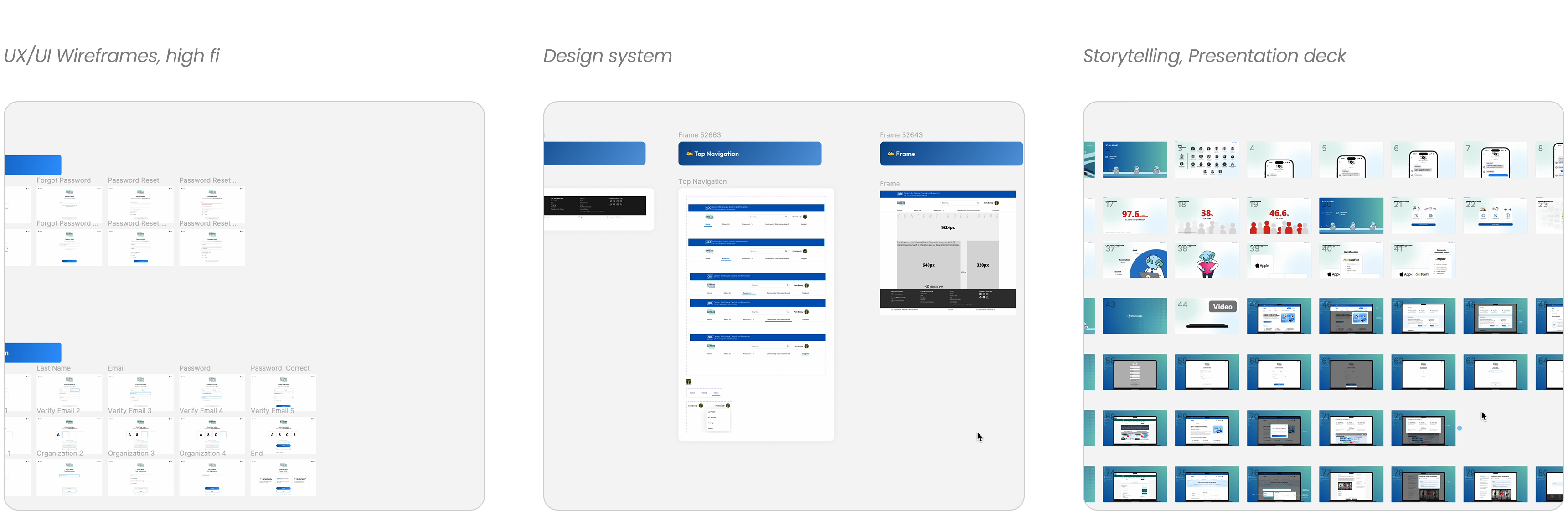
Mid-Fi Wireframs Testing
Following the mid-fidelity design phase, we conducted usability testing to evaluate the effectiveness of our proposed functionalities and visual elements.
We conducted A/B testing with 21 participants to compare task completion times between the current CSC website and our redesigned version.
Additionally, we tested two color variations to evaluate user preferences and accessibility.

Does it really work for real users?
Mid-fi Testing and Iteration
After completing our mid-fidelity designs, we conducted usability testing with five participants and quickly iterated based on their feedback. This helped us validate key features early and refine core interactions without overinvesting in high-fidelity details.

1. Homepage before and after

2. Resources page before and after

3. Support page before and after
4. Ask for help page before and after
5. My activity page before and after

Design System
System Thinking for Scale, Streamline the Design + Dev Process
As Design Co-lead, I created a new style guide and helped build a custom design system from scratch to unify the National DPP website. We addressed the lack of structure within Salesforce by standardizing color, typography, and components, improving visual hierarchy, consistency, and accessibility across all pages.

Weekly Review Session
Easy onboarding – Confidence starts here
Challenge
Usability testing revealed that the page felt outdated and disconnected, with users frustrated by having to type and track confusing organization names manually.
Solution
We streamlined and clarified the sign-up flow, making it quicker, more approachable, and visually aligned with modern UX standards, enhancing user confidence.
A clear path to the website mission
Challenge
Cluttered content and weak visual hierarchy made it hard for users to find key information or take action, and there were no strong CTAs to support onboarding.
Solution
Improved visual structure highlights the National DPP’s mission and key resources, with a clear CTA, a newsletter sign-up awaits, inviting continued engagement.
Modern Discussion Board - Organized Discussions & Better Connection
Challenge
An overly long navigation menu, repetitive categories, and lack of visual separation made it hard for users to find relevant resources and understand content structure.
Solution
We reorganized the layout and refined the interface to improve discoverability, helping users locate the right information faster and with less friction.
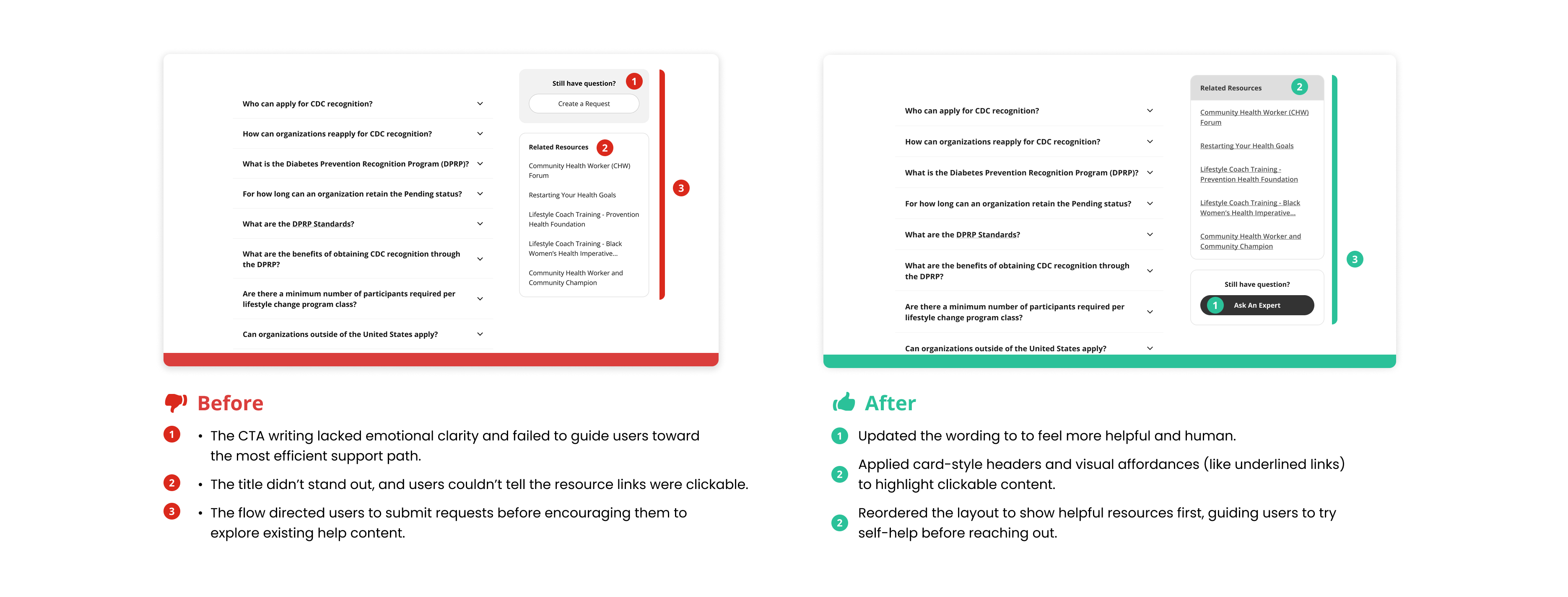
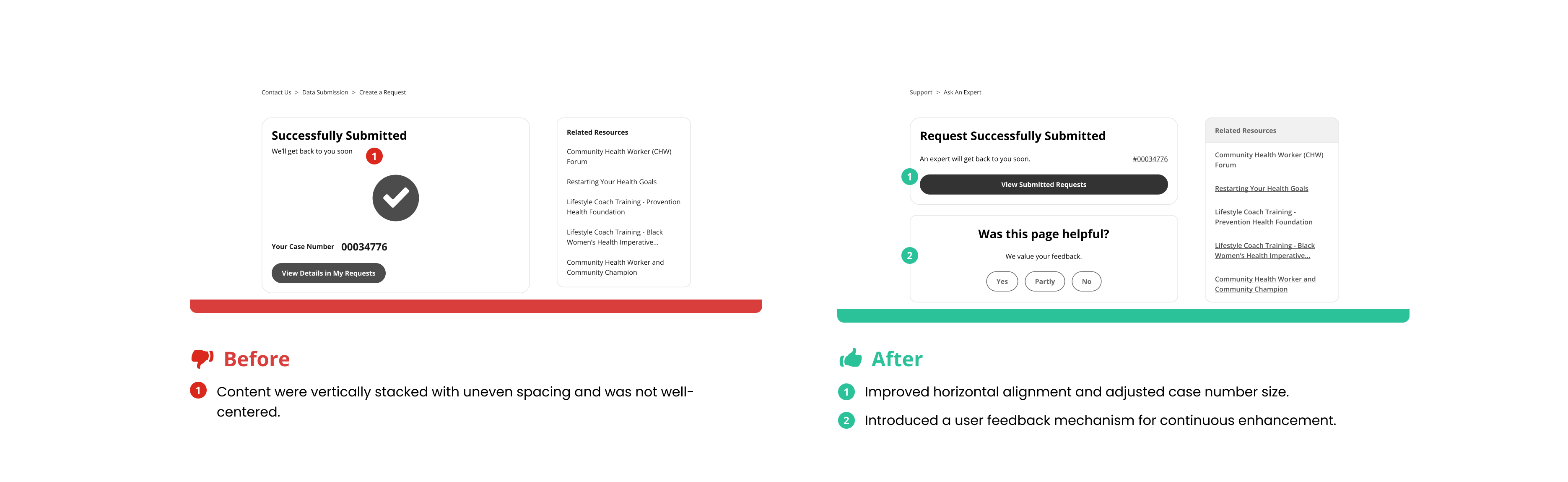
Unified Support Hub – Instant Answers & Seamless Help
Challenge
The original interface exhibited fragmented user flows between the FAQ and Contact functions, compounded by redundant entry points and insufficient information.
Solution
We redesigned “FAQ” and “Contact Us” sections into a unified Support page with visual FAQs and clear category segmentation, streamlining navigation and reducing cognitive load.
Collaboration
We explored ideas like gamification and custom UI elements early on, but after two working sessions with Salesforce developers, we gained a clearer understanding of the platform’s limitations. While some visual changes were possible, key layout components proved more challenging to alter without compromising long-term stability.
These conversations helped us ground our designs in what's technically feasible.
Throughout the project, we also held weekly checkpoints with PM, designers, and Deloitte stakeholders. Their input on everything from feature feasibility to data sourcing, challenged us to stay grounded, validate our ideas, and ensure each decision was practical for both users and the business.